An exciting challenge
Imagine two distinct websites, with different audiences, and the challenge was to bring them together into one. And a website with Pardot from Salesforce integration? That’s exactly what a leading company in the potato industry brought to us. Besides putting them together, the goal of this project was also to redesign their look and feel.
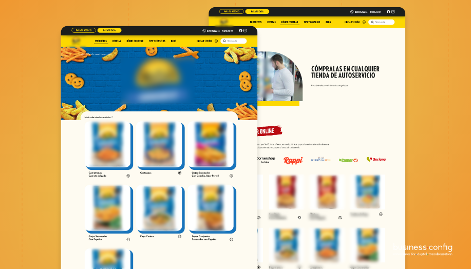
The company had a website dedicated to the restaurant business and another dedicated to the consumer, each with its own image. The outcome was a single website with the areas B2B and B2C separated, but with a much more similar image between them. In addition, an area of the website was dedicated to communicate the company’s brand, as well as its mission and values.
Where to start?
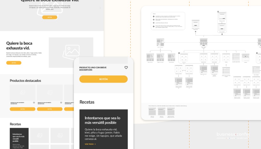
At the beginning of the project, our team focused on studying all the content of both websites, and on understanding with the client what was most relevant and what would eventually be left out.
This made it possible for us to come up with a proposal for a new sitemap and wireframes that would suit and serve everyone the best.
The new solution found to access the different areas was a top bar with three buttons:
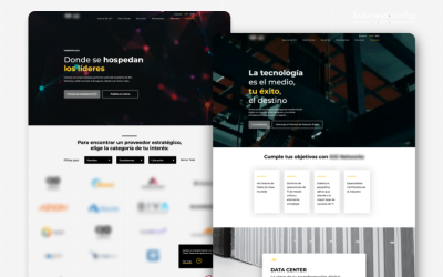
Para tu negocio (B2B), Para tu casa (B2C) and Nosotros.
Both areas wanted to have information and content on their products, and also the possibility to sell online in the future. Therefore, the website was built with WooCommerce, which enables the entire platform to be ready for a future online store.
A new look
The UI team had the challenge of creating an overall image for the two areas, yet distinguishable from each other. A very interesting job which required a thorough study of the brand’s existing manuals and also of all the existing websites (from the brand’s universe).
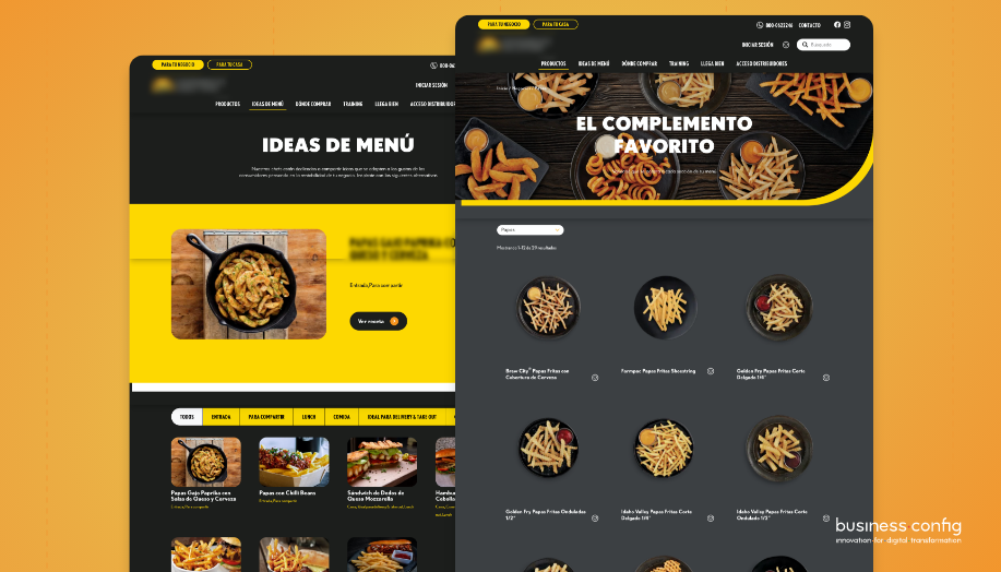
The same structure was used for both areas of the website, in terms of organization and the presentation of information and products. Other common aspects that helped form a coherent image was using the same font and the same format for the buttons.
The difference between them was essentially based on the colors used, for the B2B segment we used darker colors such as black and gray, while in the B2C segment we used lighter colors such as beige and orange. The color yellow was used as a unifying color for both sections.
WordPress Website + Pardot Integration from Salesforce
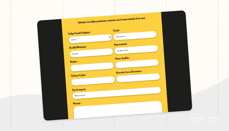
Lead acquisition was a very important point in this project (as it should be for any business). There was a need to redesign the contact forms in both sections of the website.
Specifically, in the B2B section a form was added to find the brand’s products and its distributors, using the Postal Code field, that returns results already redirecting the user to the corresponding sales person.
The custom-made forms were then integrated with Salesforce’s Pardot platform, a program used globally by the brand.
Advantages of connecting Pardot with WordPress:
- An improved end-user experience through customization.
- Easily add forms and dynamic content to your WordPress website using text regions and widgets.
- Campaign tracking code that allows you to understand the activity of potential customers and visitors to your site.
This was a challenging project from start to finish, but at the same time it resulted in a product that made us all happy.
If this kind of solution makes sense in your company, we are here to develop the next solution.